When looking to make healthy changes to your life, the first step might be revaluating your shopping cart. In our everyday lives, many of us are making small, continual changes to get healthier. It’s these gradual changes that can slowly move us toward healthier lifestyles. Swapping brands to something lower in sugar might keep a staple in your diet while also helping us get on track to where we want to be.
It would make it significantly easier if you could spot the best choice at a glance. However, thinking that brands will make it is for us is far too much to hope for! Today we’re looking at some of the psychological tricks they use to fool even the savviest among us into believing we’re making healthy choices.
Wording on labels can be confusing. Words and phrases like “multi-grain,” “trans-fat free,” “all-natural” and “organic” can make us see virtue in foods that are junk. These honest sounding words can mean very little when you actually look at the ingredients. The definition of these terms is loose and, while something may be all-natural, that doesn’t mean it’s all all-great.
There are other vague health claims, such as “a good source of” or “no artificial colors.” The FDA regulates the term “good source of” to mean a product has at least 10 percent of your daily intake. But, just because something contains 10 of your daily vitamin A doesn’t mean it can’t also provide 200 percent of your sugar. The same for statements like “no artificial colors.” Just because something was dyed with fruit juice doesn’t change the fact that it was dyed.
When it comes to serving size, you have to check twice. The picture on the box may show a giant portion of food. But, a look at the back will show you that there are eight portions in a container that you thought held just one.
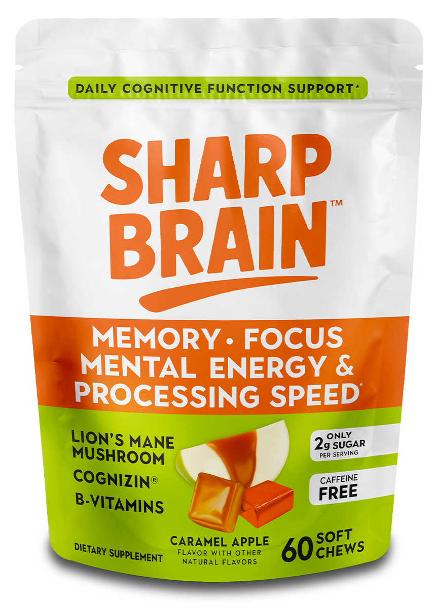
A different virtue-signaling technique is to place meaningless or misleading buzzwords on food. This can most frequently be seen in the modern trend of slapping “gluten-free” on everything. Gluten comes from cereal grains. Yet, the claim can be spotted on many products that have no grain in them. It’s like printing “vegetarian” on the sticker for an apple.
Even when we look at just the aesthetics of a product, we are being manipulated. Pale and muted colors tell us that something is natural and healthy. Maybe that relates to the issue of “dye.” If the packaging is muted, it tells us the product inside is largely unadulterated and wholesome. The same is true of brown paper packaging. It sparks off our brain — thinking it’s ecofriendly and consumer conscious. It subtly tells us it’s the healthy choice without a word. The mind trick can also be performed by putting pictures of farms or nature suggest that what we are buying is made from high-quality whole foods.
So, now knowing all this, when making healthy swaps, always look at the actual nutrition information and find out if you’re making an upgrade or buying into false advertising. Hopefully, this will help us all make better choices!

